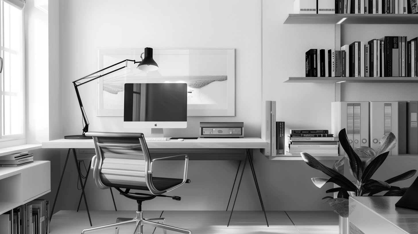
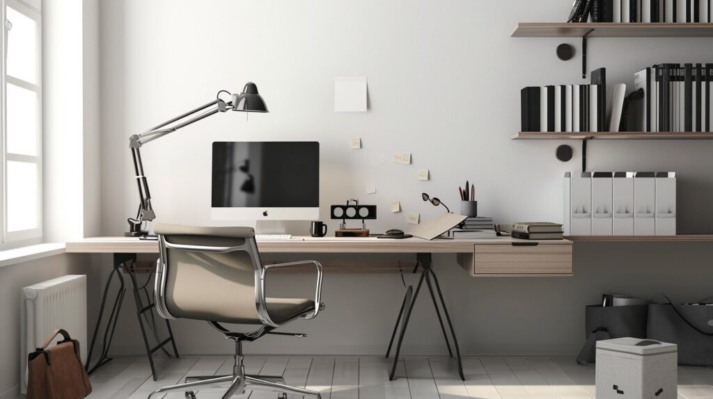
I don’t want to make this a big deal because it’s very easy to get too caught up in the design of your site, but if you screw these things up, you might as well not have a site.
There I said it.
5 Web Design Mistakes You Can Not Make
By no means do you need to have the world’s prettiest site. You simply need a site that people can use. People aren’t going to sit down and stare at your site. Most people that come to your site are going to be on their phone anyways so how much will they really see?
But if you really want to make sure that you give yourself the best chance of success then avoid these mistakes at all cost.
1. Your Text Is Too Small
Let’s start with an easy one.
Having small text on your site can seem cool, but it’s a pain to read. Nobody believes that your content is worth straining their eyes to the point that they need an eye exam.
With your body copy (blog posts, pages, landing pages, sales pages) you should aim for at LEAST 18 pixel size font. I tend to go with 20px – 22px depending on the font.
This means that not all fonts are created equal.
18px with Georgia will look different than 18px with Arial.
You don’t need to make it so big that there are just 2 letters on a line, but you don’t want people pinching and zooming to see what you’re trying to say. It’s much easier for them to just leave your site.
2. Invisible Text
This is another “cool” thing that people try to do. Light font on a light background looks cool, but that’s it.
It just looks cool. It’s impossible to read.
If you’re using a light background then use a dark font that contrasts well with it. This ties into the first mistake.
Basically, just make your content easy to read.
3. Super Long Line Length
Did you think we were done with content? Because we aren’t!
You want to make sure you don’t have a super long line length.
This isn’t a problem on mobile devices but is a huge problem on desktops. It’s when you go to a site and the text goes across the whole screen. Reading it is like following a tennis match. Your eyes are just going back and forth. You end up getting sick.
Keep your line length between 45 – 65 characters. You don’t have to count them. You should just have a good feel for when too long is too long.
If it’s impossible for you to control your line length in your site’s theme then you can counter it a bit by increasing the font size.
4. Non-Obvious Links
If you have a link on a page make it obvious. Don’t make people guess which pieces of text are links and which aren’t.
You include links on your pages because you want people to take action.
Therefore your links should have a different look than your text. You can accomplish this a number of different ways:
- Different font color
- Having an underline
- Different background color
- Using a different weight (bold)
Links should be obvious. One of the blog design best practices is to make links noticeable. They are meant to be clicked to help your reader move throughout the wonderful resource that you’ve created.
5. Too Many Distractions
This is where people start to get out the pitchforks.
I need pop-ups! I need ads!
I know, you need it all, but how much is that ruining the experience of your site? The reality is that each page on your site has a job.
You want a person to take a specific action when they get to your site and visit a page.
You have to ask yourself what action do you want them to take.
- Is it to click on an ad?
- Is it to fill out the pop-up?
- Is it to read the content?
- It it to check out the sidebar?
What do you want them to do?
Once you figure that out then you’ll begin to see if your design is taking away from that or not.
Want to Make it Easy to Avoid These Web Design Mistakes?
A simple, easy to customize theme will make it easier for you to avoid these costly design mistakes.
We use and recommend GeneratePress.
It’s About the Experience
First and foremost it’s about the user experience when they come to your site.
You might have a million goals that you want someone to accomplish when they get to your site, but if they find it hard to use then they won’t bother with any.
A decent design will give you a fighting chance of getting people to stay on your site longer and taking the action that you want.
A design that makes this difficult just means a quick exit because what’s the point?
Looking at the different Makers Mob brands and you’ll notice the common denominator between them all is that they provide a pleasant reading experience. Would it be fun to have things move across the screen?
Maybe.
But that’s not the purpose of the sites. The purpose of the sites is to help you consume content that will help you move along your journey.
If the experience does anything else before it does that then it’s a failed experience.